Website and Rebranding for WSK Bank.

WSK Bank Rebranding & Relaunch

The rebranding and website redesign brought renewed clarity to the bank’s digital presence. The modern design system, refined typography, and a user-centred information architecture create a clear, intuitive experience — strengthening trust while making everyday banking simpler, more accessible, and more human.

hero video

Imagery

The imagery communicates trust on a symbolic level. Austrian mountains, climbers, and outdoor scenes represent stability, perspective, and shared progress — expressing reliability and long-term partnership without relying on financial clichés.

Portrait of Erika Holemar-Populorum, Marketing & Sales WSK Bank
"Working with functn felt like a true partnership. They understood our brand and translated it into a digital experience that feels modern, sophisticated, yet unmistakably WSK-Bank."
Erika Holemar-PopulorumHead of Marketing, WSK Bank

Evolution, Not Reinvention: Extending the color system

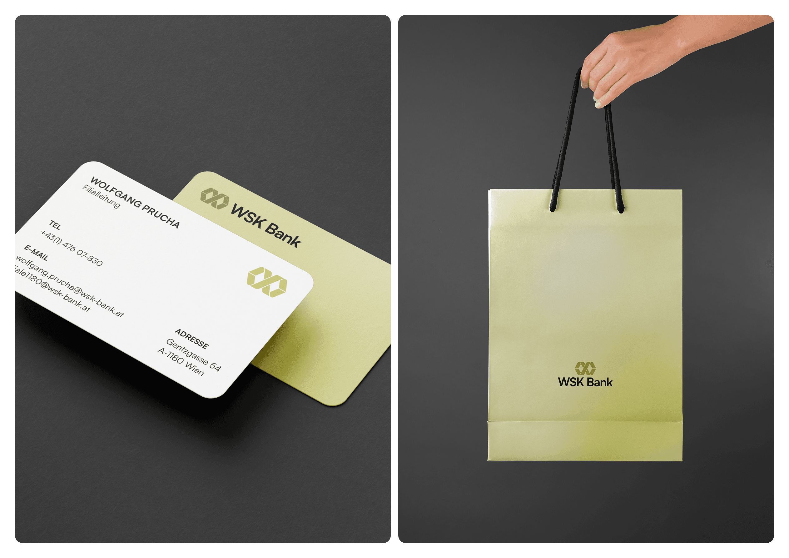
The color system builds on the bank's existing palette, refining and extending it rather than replacing it. By introducing intermediate tonal steps, we created smoother transitions and a more coherent color hierarchy. This same palette was carried through to printed materials such as business cards and tote bags, extending a consistent, modern appearance across digital and print while preserving familiarity and trust.

The new website is exactly what we set out to achieve: a clear, trustworthy digital presence that makes banking simpler for our customers — without losing what makes us who we are.
Mag. Andreas MaleschekCEO, WSK Bank

Project details

Services

Technologies

  • Sanity
  • Vercel
  • Figma
  • next.js
  • Usercentrics
  • Postmark